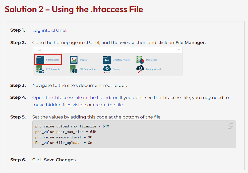
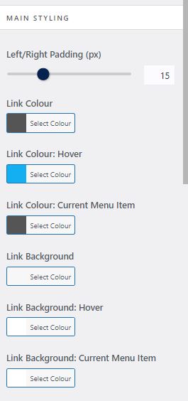
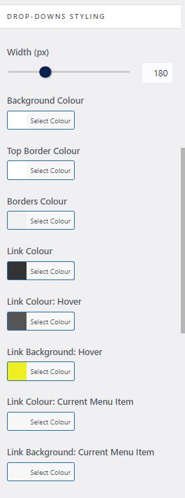
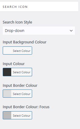
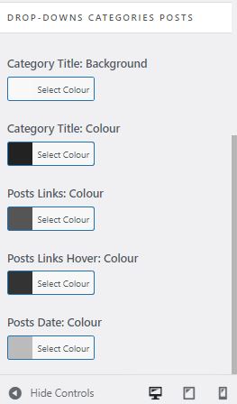
So I was getting this in an InMotion install.
Category: Wordpress
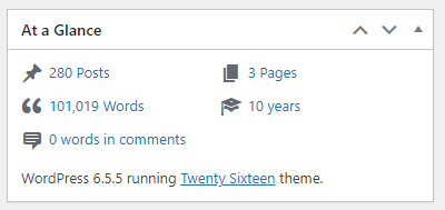
WP Handy plug in for counting your posts…
Additional CSS for WordPress
Very useful when coupled with OceanWP and Code Block Pro – Beautiful Syntax Highlighting
.newwidth {
        width: 600px;
        max-width: 100%; /* This prevents it from exceeding the screen width */
        margin: 0 auto; /* This centers the block horizontally */
        text-align: center; /* This centers the content within the block */
    }
WordPress and OceanWP(theme) – Default config for blank Blog
WordPress is excellent but setup through the admin menu system seems to me unintuitive and a standard configuration can be really difficult to replicate. I constantly wrestle to get sites how I like them. I resolved to document a standard configuration with WordPress and the theme OceanWP (free version) to speed things up.
What are my preferences on good design? A wide section for text and obvious and intuitive search option with menu that can be setup dynamically to add new posts to menu under their respective category without continually needing to alter the Menu design.
It should be noted that I don’t use the OceanWP theme for this site – which is a historical thing.
I’ve used OceanWP theme (Free version) for some time its a good free popular WordPress theme.
You can read more about Oceanwp here
My shared hosting provider is InMotion I have found them to be excellent particularly their online support which is 24/7 link here
Firstly install a default WordPress website. My provider uses softalicious through cPanel your preferred web management hosting platform may vary. I won’t document this stage
Next install the OceanWP Theme and add Plugins.
Next I add my preferred plugins, some of which come with shared hosting WordPress installation;
.
Next Default configuration of OceanWP WordPress theme using the above plugins
Settings / General
– alter site title and tagline
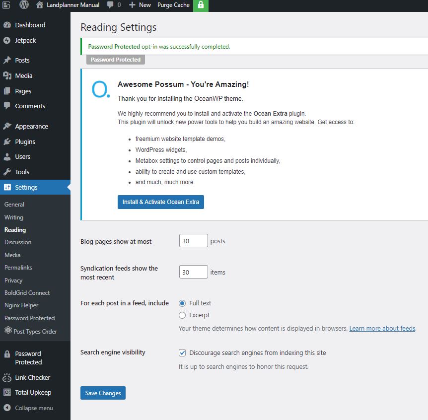
Settings / Reading / Search engine visibility
Set as appropriate either tick yes to encourage or clear to discourage
– Discourage engine visibility
This is also where you show blog posts as either Full Text or just an Excerpt. If you are on Full text there is little point in having the Read more element in the blog element positioning section.
Settings / Permalinks
Apparently this helps with SEO
– Postname
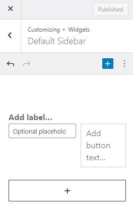
Appearance/Customize/Widgets/Default Sidebar
This is where you can add elements and alter the order of elements in the sidebar. I find the admin design clunky and unintuitive but I eventually discovered how to do it, use the edit icon and three vertical buttons to add and subtract elements (search is not added and removed from the sidebar here for example).
Appearance / Menus
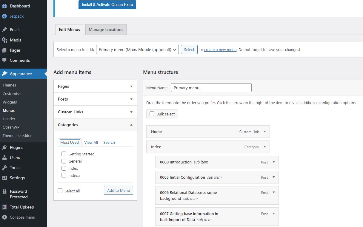
I set up a menu called Primary Menu and add Home and Index to it as follows. Note that Home is a Custom Link and Index is a Category Link. Note if Home is not available you can create it and then add it.. the url link will just be the default domain.
Appearance / Widgets
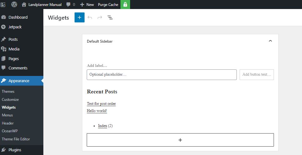
You can highlight recent comments and delete the entire block – I also add the category list to the side bar
Appearance / Customise / General Options
– Layout Style – Separate
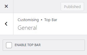
Appearance / Customise / Top Bar / General
Turn off Top bar by ensuring the ENABLE TOP BAR tick box is blank
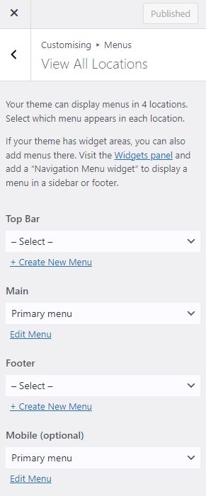
Appearance / Customise / Menus
Here I am ensuring the menus are not repeated. In OceanWP there are four places where you can place menus. I turn off Top Bar and I don’t like the Menu being in the footer so I leave both at the default blank -Select-
Appearance / Customise / Blog
We are given two options here – Blog which is the overall and Single Posts. I will normally remove the sidepanel for the single posts and I am still considering whether I should remove the side panel for the full list of posts, either way you do both here.
Appearance / Customise / Header / General
I haven’t experimented with all the different options but one that seems to work is Minimal so these are the settings

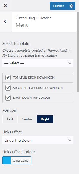
Appearance / Customise / Header / Menu
Again there are a lot of options here and not all seem to work or seem to be intuitive so I have settled on the following
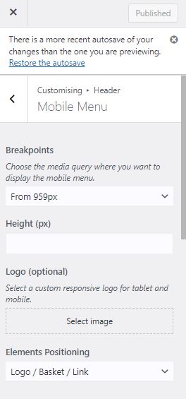
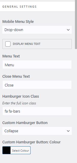
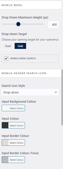
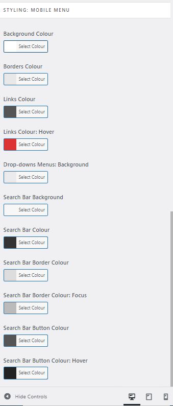
Appearance / Customise / Header / Mobile Menu
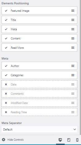
Again a lot of options but here are a set that I am happy with and work. It should be noted see the drop down Elements Positioning it likes to have the Logo at the front otherwise the magnifying glass can disappear. Note if you change it there is sometime lag on display this might be related to your hosting provider and caching (not sure)
Appearance / Customise / General Options / Theme Icons
I like to set to Font Awesome
![]()
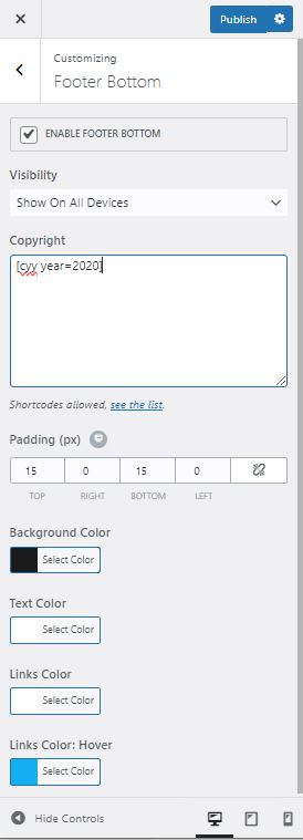
Appearance / Customise / Footer Bottom
A nice touch to ensure that copyright is Set – here we use the shortcode from the plugin
Appearance / Customise / General Options / Scroll to Top
If you haven’t installed a Sticky Header this can be a reasonable alternative OceanWP specific
Next lets make sure the search box is above content on mobile devices I like this as it makes it really obvious to users on mobiles about how to use the search facility. The search facility to my mind being one of the most important things in a wordpress site. I also like infinite scroll.
I’ve pretty much documented everything here – I haven’t touched the logo which is how you get the icon on a site which is also something you are going to do. I will come back to this post and add that when I am doing that in anger for a demonstration site. Remember if you are reading this that these options are relevant to WordPress with the Free theme of OceanWP installed at October 2023.
WordPress Useful Plugins
I am increasingly using WordPress and as I have used it more and more I am finding difficulties in managing posts and in particular knowledge base sites. The following is a random list of plugins that I have been using and that help me on a day to day basis.
Dashboard word count – creates a really nice summary of all the posts that you have made.
Syntax Highlighter Evolved – place nicely coloured code boxes in posts
Link
I used the above code block plugin but now prefer the below one it has a copy option which I like but does not work well with the classic editor
Code Block Pro – Beautiful Syntax Highlighting
Post Types Order – Sort posts in any order rather than descending post date order
Link
Print Friendly – pdf individual posts
Link
Password Protected – protect the whole site
Link
There is also something called SeedProd that does have a free version but I haven’t tested this one..
Link
Broken Link Checker – Very useful for blogs where you have hundreds of links – A really nice automated script that goes through and checks all of you links.. On this site I had 511 unique links and it went through and checked them all in under an hour.
Link
Login Logo – this is an important one if you want your site to look a lot better than the standard.
WordPress Login URL change it . A very useful and simple security improvement.


